Building Accessible Web Applications
Practical Accessibility Tips for Developers
Like many of us, I also believe that every person should have the opportunity to navigate web applications effortlessly, regardless of their abilities or challenges. As our reliance on the internet grows, it becomes increasingly essential to foster inclusive online environments, which means breaking down barriers and ensuring that all users can easily access and enjoy online content.
In this blog post, I’ll try my best to share practical tips and strategies that I have learned so far, which can help enhance the accessibility of your applications. By the end of this blog, I hope you’ll have a clearer understanding of what accessibility truly means and how we can create inviting and user-friendly online experiences for everyone.
Let’s take a step closer to accessible experiences!
Understanding Accessibility
In simple terms, web accessibility refers to the design and development of websites that can be used by people with various disabilities, including visual, auditory, motor, and cognitive impairments.
Key principles
- Perceivable: Users are able to easily see and understand information. We can provide text for images, ensure good contrast, and offer captions for videos and audio.
Clear layouts also improve readability for individuals with sensory challenges.
Operable: Everyone should be able to navigate and interact with the interface easily. It includes supporting keyboard navigation and various control methods, such as voice or touch. All functions should be accessible without time limits, and interactive elements should be clearly labeled.
Understandable: Information and the interface must be clear and predictable. We should use simple language, consistent navigation, and clear instructions to help users know what to do.
Robust: Content must work well with various tools, including assistive technologies. Following web standards ensures compatibility with current and future technologies, making it easier for all users to engage with the material.
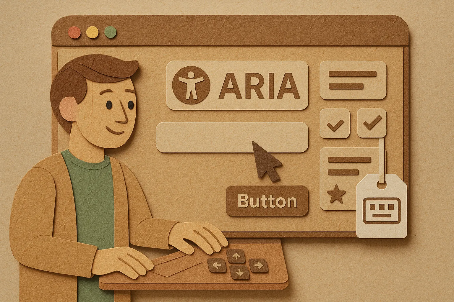
Getting Started with ARIA (Accessible Rich Internet Applications)
The Accessible Rich Internet Applications (ARIA) specification is a set of attributes designed to enhance the accessibility of web content, particularly for users who rely on assistive technologies such as screen readers and other adaptive tools by providing additional semantic information that these assistive technologies can leverage to enhance the user experience.
By implementing ARIA, we can ensure that users with disabilities can effectively navigate, understand, and interact with web applications.
Commonly used ARIA roles and properties
- Landmark Roles: These roles define distinct regions of a webpage, such as
banner,navigation,main, andcomplementary, which help users quickly locate content and navigate efficiently. For instance, using thenavigationrole allows screen readers to inform users that they are entering a section with navigation links, enhancing their overall browsing experience. - Live Regions: Live regions are specific areas of a page that can change dynamically—such as notifications, alerts, or updates—allowing assistive technologies to alert users as these changes occur. By marking content with the
aria-liveattribute, developers can control how updates are announced, ensuring that important information is communicated promptly without disrupting the user’s flow. - Button and Link Roles: Standard HTML elements can be augmented with ARIA roles, such as
buttonorlink, to clarify their purposes further. This is especially beneficial for users who use custom controls, as it ensures that all users, regardless of their abilities, can understand and effectively utilize interactive elements.
Key considerations
- Implement ARIA by following best practices that prioritize clarity and usability.
- Use ARIA to enhance accessibility, but do not substitute it for native HTML features. Native HTML elements are inherently accessible and provide necessary semantic meaning.
- Use ARIA attributes where necessary. Over-reliance on ARIA can lead to confusion and negatively impact user experience.
- Conduct regular testing with users of assistive technologies.
- Fine-tune implementation to uncover potential barriers.
And lastly, ensure the web remains an inclusive space for all.
Keyboard Navigation
Many users rely on their keyboards to navigate websites and applications, often avoiding the use of a mouse. This design choice improves the experience for people with disabilities, such as those who struggle with hand use or visual navigation.
By ensuring that all interactive elements—such as buttons, links, and forms—are accessible via keyboard shortcuts, we can create a fair and inclusive environment for all users.
Tips for designing keyboard-friendly interfaces
Clear Focus Movement: It’s important to manage where users’ focus goes as they navigate the interface with their keyboard. When using the keyboard, the highlighted area (the focus) should move clearly and predictably, especially after actions such as submitting a form or navigating between different parts of the page. This might involve adjusting the focus layout and ensuring that users can easily identify their current position within the interface.
Skip Links and Helpful Markers: Adding skip links and navigational markers can enhance the experience by allowing users to skip repetitive content, such as lengthy menus, and directly access critical areas, like the main content. This makes navigation quicker and less frustrating, which is better for everyone.
It’s crucial to regularly test keyboard navigation to make sure that everything works properly without a mouse. This involves testing various keyboard-only navigation scenarios to identify any potential issues that may hinder user interaction.
Color Contrast and Visual Design
When it comes to visual accessibility, color contrast and design play a crucial role. A well-thought-out visual design not only enhances aesthetics but also ensures that everyone can access and enjoy content effortlessly.
Let’s see how we can make every visual experience inclusive by prioritizing contrast and thoughtful design!
Color contrast ratios
Maintaining sufficient contrast between text and background is crucial for enhancing readability, especially for users with visual impairments. The Web Content Accessibility Guidelines (WCAG) set forth specific contrast ratio recommendations to ensure that text is easily discernible against its background.
For example, a minimum contrast ratio of 4.5:1 is suggested for normal text, while larger text requires a lower ratio of 3:1.
These guidelines serve to create a more inclusive digital environment, allowing all users to access content without strain.
Tools for checking contrast
To evaluate and ensure compliance with color contrast ratios, several user-friendly tools are available. One highly regarded option is the WebAIM Contrast Checker, which provides a simple interface for inputting foreground and background colors. This tool not only calculates the contrast ratio but also indicates whether it meets WCAG standards.
Other tools, such as the Color Contrast Checker by Coolors and various browser extensions, also offer similar functionalities to easily assess and adjust their color choices for improved accessibility.
Color blindness and other visual impairments
When designing for accessibility, it is essential to recognize that color should be used as a supplementary means of conveying information rather than as the sole method. This approach benefits individuals with color vision deficiencies, who may struggle to distinguish between certain colors.
To enhance accessibility, consider combining colors with descriptive text labels or patterns. For instance, using bold text alongside a color-coded chart ensures clarity and understanding.
Employing textures or shapes can also provide alternative ways to represent data, making it more accessible to a wider audience, including those with different visual impairments.
Conclusion
When I started writing this article, I didn’t anticipate it becoming this long. And as the read time is coming closer to 7 minutes, I’m going to have to split this into a multi-part series that also covers building Forms that are accessible and some tips on how to test for accessibilty.
For now, that’s all folks!